What Is a Brand Portal? A Plain-English Guide (2026)
A brand portal is a place where logos, brand colors, and guidelines live so partners can grab the right files without bothering you. Here's how they work.
It's 4:47pm on a Friday. The printer your operations lead found on Yelp emails you. *"Can you send the logo? Vector if you have it, no tagline, something that'll print clean on a navy background."*
You start hunting. There's a folder called `Logos_FINAL`. Inside it, a folder called `Logos_FINAL_v2`. Inside that, a folder called `Logos_use_these_ones`. You open three files. They look identical until you zoom to 400% and notice one of them has a stray pixel where the kerning got nudged in 2021 and never fixed. You're not sure which version is current. You're not sure who would know. The designer who built the system left twenty months ago.
You send what looks closest, hope it's right, and start your weekend with a quiet knot in your stomach.
This is the moment most people first Google "brand portal." If you arrived here that way, this is the article that explains what one is, what it actually does, and whether it solves anything for you. Or whether, as is often the case, you're being sold enterprise software you don't need.
The plain-English definition
A brand portal is a centralized web page (or small set of pages) where your logos, brand colors, fonts, templates, and usage guidelines live. From it, anyone who needs an asset can grab the right one in the right format without going through you, your designer, or your operations cousin who runs the website.
That's the whole concept. It's not complicated. A clean URL. A handful of assets. A few rules. A download button.
What makes a portal different from the `/Brand/Logos/` folder you already have is that a portal is built for the person on the other end. Your printer doesn't need to know that the SVG goes to web and the EPS goes to print. The portal just shows them their options, labeled in plain language, with the right file types pre-baked. Click. Download. Done. Without an email to you first.
How we got here
It's worth pausing on this, because the answer explains why your folders are the way they are.
There was a brief, beautiful period (roughly 2002 to about 2012) when most companies had one designer or one agency, who maintained the logo files on a single hard drive, and any time someone needed the logo, they asked that person. The asset and its custodian lived in the same place. Brand asset management was a desk and a name.
Then a few things happened at once. Companies got bigger. Marketing teams got specialized. Vendors multiplied. Brand books moved to PDF. PDF moved to Notion. Notion moved to Google Drive. The original designer left for a startup. The new designer used different folder names. Someone uploaded a "v3" without deleting "v2." A junior marketer pulled the wrong file for a trade show banner that ran for nine months before anyone noticed.
What used to be a tight, single-custodian system became a distributed mess of files spread across Drive, Slack, Dropbox, three email accounts, and the design lead's personal MacBook. The cost of this mess shows up as one email per Friday at 4:47pm, but the deeper cost is that nobody can tell you, with confidence, where the current canonical version of the logo lives.
A brand portal exists to put the custodian back. Not as a person. As a URL.
What's actually inside one
A well-built brand portal contains a few clear sections, each doing one job.
The first is the logo system. Not "the logo" but every legitimate version of it. Primary lockup. Secondary lockup. Icon-only. Horizontal. Stacked. Monochrome. Reversed for dark backgrounds. The rare version with a tagline that only marketing uses. Each in the formats people actually need (SVG for the web, PNG at two or three sizes for documents and social, PDF for general sharing, and EPS for the holdouts in print).
The second is the color palette, written out properly. Not "kind of a teal, you'll know it when you see it" but HEX, RGB, CMYK, and Pantone values for every color, with a sentence about when to use each one. Primary versus accent. Where it can sit on text. Where it absolutely cannot.
The third is the typography, with download links or licensing information. Half of all off-brand designs happen because someone couldn't find the right font and substituted something close-ish from Google Fonts. A portal that just lists the font is doing half the job. A portal that links to where to get it does the whole job.
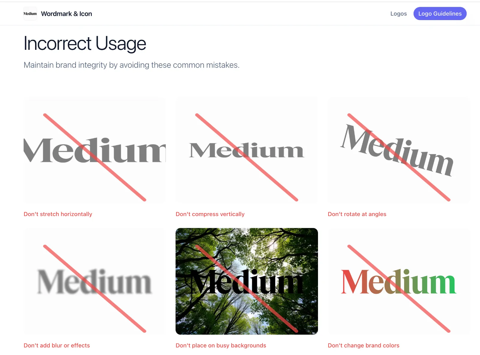
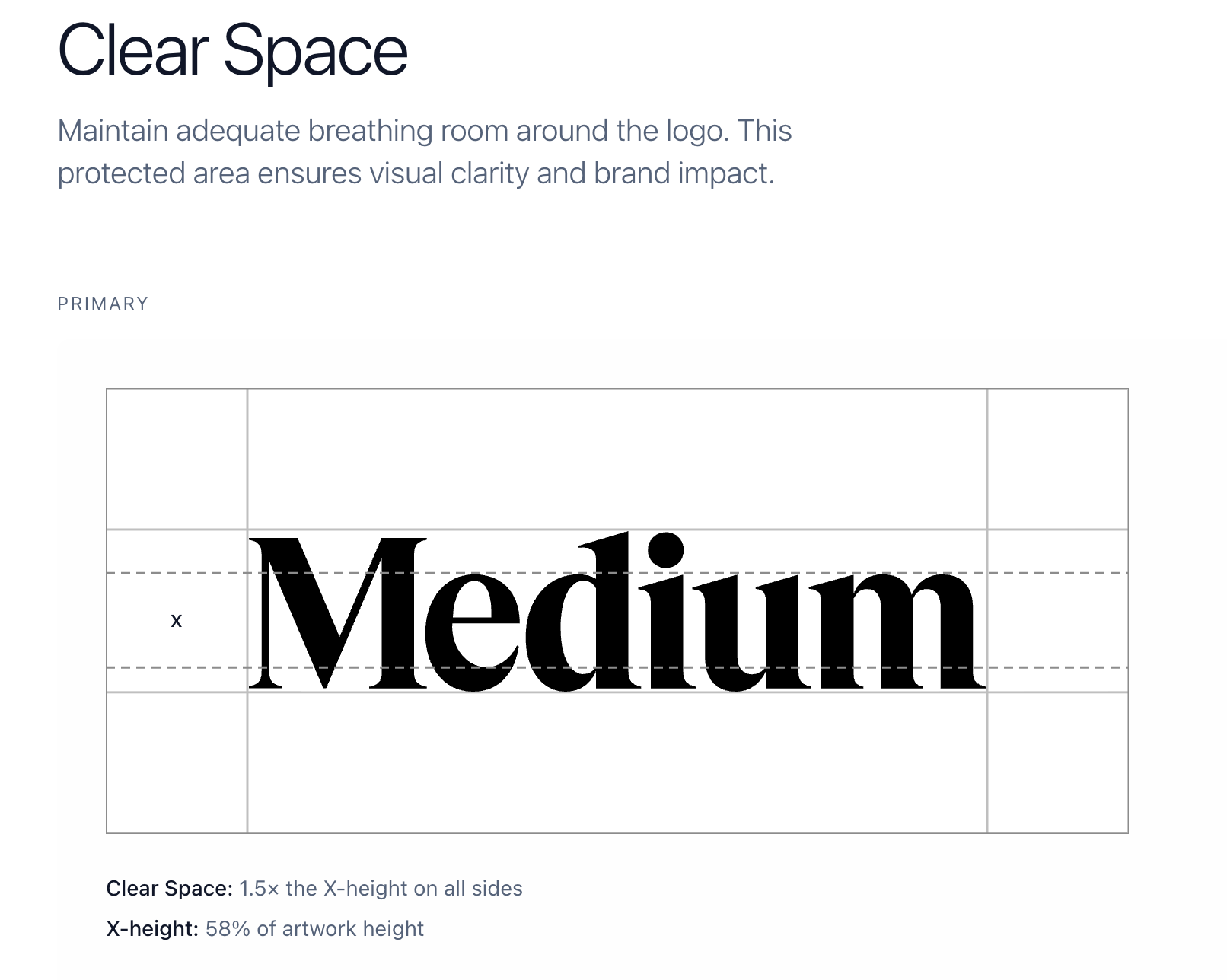
The fourth is the rules. Logo clear space. Minimum size. What you absolutely cannot do (stretch it, recolor it, drop-shadow it, place it on a photo of a sunset). These are the brand guidelines, and a portal makes them impossible to miss because they sit one inch away from the file you're about to download.
Some portals add more: photography, icons, slide templates, social kits, swag artwork, video stings. Some get sprawling. Most small companies do better keeping it tight and focused on what people actually ask for. The portal you'll use is the one that loads fast and shows you the thing you came for.
Why a shared folder isn't enough
In fairness: sometimes it is. If you're a five-person company and the only people who ever touch your logo are you and one freelance designer, a tidy Google Drive folder is perfectly adequate. Nobody should sell you software you don't need.
But shared folders break down in specific, predictable ways once more than a handful of people start grabbing files. They break down so consistently that you can almost set your watch by it.
Version drift. Someone downloads the logo in 2023, saves it to their desktop, and uses that same file for two years. Through a rebrand. Through a color update. Through a wordmark refinement. By the time you spot it, it's on a conference banner with a thousand attendees walking past.
Format confusion. You send the JPG, because that's what sat at the top of the folder. They drop it onto a website with a colored background. Now your logo has a hideous white rectangle around it, in front of fifty thousand monthly visitors. A portal hides the wrong format behind the right one, so this stops happening.
Permission chaos. Folders sit at two unhappy ends. Either they're locked down so tight nobody can access anything without you, which makes you the bottleneck. Or they're open enough that someone can also accidentally delete your master file. Portals solve this by being read-only by design.
No context. A folder is just files. A portal is files plus the rules around them. "Don't use this version on dark backgrounds" lives next to the file itself, not buried in a 40-page PDF that no human will ever open.
Findability. Quick. Which folder has your most recent brand guidelines? `/Marketing/`? `/Brand/`? `/Design Assets/`? `/2024/`? `/_archive/`? You see the problem.
Each of these failure modes is small in isolation. Together, they describe about 80% of why most brands look slightly inconsistent in the wild.
Brand portal vs. DAM
If you've been researching this, you've already run into the term DAM, short for Digital Asset Management. Bynder. Brandfolder. Frontify. Widen. Canto. MediaValet. There are dozens of these platforms, they all cost real money, and they all overlap with brand portals in confusing ways.
Here's how I'd draw the line.
A DAM is built for marketing teams that produce a lot of content. Campaigns. Photo shoots. Video edits. Region-specific variants. Seasonal pushes. The problem a DAM solves is internal. We have 40,000 files and we can never find the one we made for the German market last spring. DAMs are about cataloguing, tagging, version control, rights management, workflows, approvals. They are powerful, and they are heavy. They typically take weeks to set up and months to fully roll out.
A brand portal is built for a much narrower moment. Someone outside your team needs an asset. They need to get it right. They need to do it without you. Vendors. Partners. Freelancers. Press contacts. Resellers. The portal's job is delivery and clarity, not internal management. The setup is dramatically simpler and the surface area is much smaller.
Some platforms try to do both. Frontify and Brandfolder, for example, position themselves as DAM-plus-portal hybrids. They're genuinely good if you're a 500-person company with a dedicated brand team and an enterprise budget. They're overkill if you're a 12-person startup whose actual problem is that your sales reps keep emailing prospects a logo with last year's tagline.
A useful test for figuring out which one you need is to ask who the user is.
If the user is your internal marketing team, drowning in their own files and unable to find the campaign hero shot from May, you want a DAM. If the user is everyone else (the vendor, the printer, the partner, the journalist) and you want them to get it right without asking you, you want a brand portal. If you're not sure, you almost certainly want a brand portal first. They're cheaper, they're faster to set up, and you can always add a DAM later if you outgrow one.
One thing to note: many teams describe DAMs as "brand asset management," and that's where the categories blur. The phrase is technically accurate. But in industry usage, "brand portal" tends to mean a public-facing or partner-facing delivery surface, while "DAM" tends to mean the internal warehouse. The words matter less than what you're trying to do with them.
Do you actually need one
Three rough tiers.
You probably don't need one yet if your logo lives in three places (a website, an email signature, a deck template), all controlled by the same person, and you've never had an external person ask for an asset. Keep your folder tidy and check back in a year. Don't let anyone sell you a solution to a problem you don't have.
You're at the painful crossover point if you can name at least two times in the last six months you've had to dig up the right logo file for someone external. Or you've been on a sales call and noticed a partner using a stretched, outdated, or wrong-color version of your mark. This is the threshold where a portal starts paying for itself. Not in money. In your time, and in the integrity of how your brand appears in places you don't directly control.
You definitely need one if any of the following are true. You have resellers or partners who use your branding. You've been through a rebrand and old assets are still circulating. You work with multiple agencies or freelancers. You license your brand in any way (franchise, affiliate, co-marketing). Your sales or customer success team forwards "can you send the logo?" emails to design more than once a month.
That last one is the giveaway. The volume of internal forwarding is the single most reliable signal that your brand has outgrown its filing system.
What separates a good brand portal from a bad one
I've poked around a lot of these, both as a user and from the inside. The difference between portals people actually use and portals that get abandoned within a quarter comes down to a few things, almost all of them about reducing friction at exactly the moment friction would cause someone to give up and email you instead.
Friction at download. If I have to make an account, verify an email, agree to terms of service, and click through three screens to get a PNG of your logo, I'm not going to do it. I'm going to scream into a couch cushion and email you for the file instead. The best portals let approved users grab assets in a click or two. Gating exists in the better ones, but it's proportionate to the sensitivity of the asset.
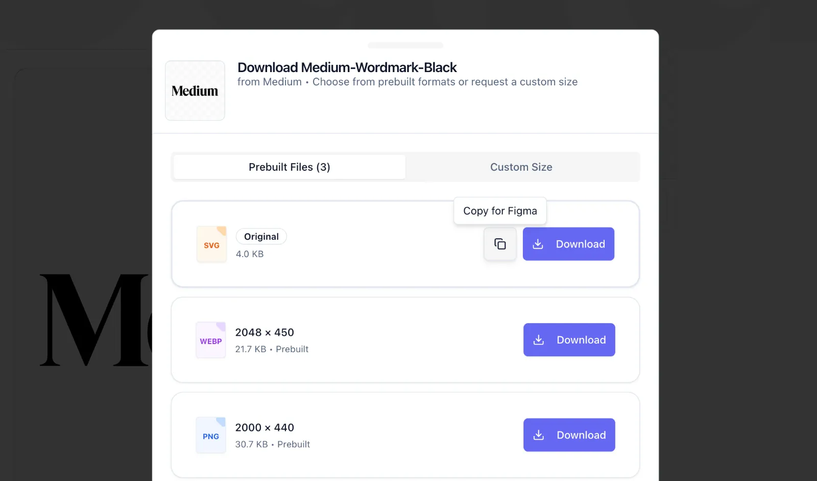
Honest format defaults. A portal that dumps every file type on you isn't helping. A good portal labels files by use case ("for your website," "for print," "for social media") and surfaces the most commonly needed format first. The user shouldn't need to know what EPS is to find the right file. The portal should know for them.
Guidelines that live next to the download. If the do-not-stretch rule lives in a 60-page document nobody opens, it doesn't exist. The portals that work bake the rules right into the download experience. Short, visual do-this-not-that examples. The clear space rule shown as a diagram next to the file. The minimum size noted on the download button. The friction of doing the wrong thing should be slightly higher than the friction of doing the right thing.
Search that works. This sounds obvious and is somehow rare. If I type "favicon" and your portal can't find your favicon, your portal has a problem. Search inside a portal isn't a nice-to-have. It's the second most-used feature after "click the right format."
Fast load and on-brand design. If your brand portal looks like a 2014 SharePoint page, people lose faith in the brand it's representing. The portal is itself a brand surface. It either reinforces your brand quality or quietly undermines it.
What setting one up actually looks like
This is the section nobody writes, and it's the one that determines whether you ever ship.
If you've been told setting up a brand portal is a "two-week project," you've been told that by someone who is going to bill you for two weeks. The actual work, for most small and mid-sized companies, breaks down like this.
First, find your real logo files. Not the JPG someone exported in 2019. The vector. Usually a .ai or .eps or .svg. This is often the hardest step, because the file might live on a former designer's hard drive, or in an old Dropbox you can't access, or in an email attachment from a project that closed three years ago. Budget an afternoon. Sometimes more.
Second, decide on your variants. Most companies need fewer than they think. Primary horizontal, primary stacked, icon-only, and a reversed (white) version cover 90% of use cases. If you only have one version, that's fine. Build the portal with what you have, add more later.
Third, collect your color codes. HEX is non-negotiable. RGB and CMYK should be straightforward to derive from HEX. Pantone is optional but useful if you do any meaningful amount of print work or branded merchandise.
Fourth, write your rules, briefly. One sentence each. "Don't change the colors." "Maintain clear space equal to the height of the icon." "Don't place the logo on busy photography." Five rules is plenty. Ten is too many for anyone to remember.
Fifth, publish, share, and iterate. The first version of the portal will be incomplete. That's fine. The biggest risk is over-engineering before launch. A portal that goes live with 80% of what it needs, today, beats a portal that goes live with 100% in three months.
The total time investment, for a team that has its files in hand, is closer to a single focused afternoon than to a multi-week project. Most of the resistance is in the first step.
The quiet cost of not having one
This is the thing nobody puts on the marketing pages. The real cost of a messy brand setup isn't the time you spend sending files. It's the slow, distributed erosion of how your brand actually shows up in the world.
Every wrong-version logo on a partner site. Every stretched mark on a conference booth. Every email signature using the colors from before the refresh. Every press article that pulled a low-res PNG off Crunchbase because nobody could find the right file in time. Each one is small in isolation. Together, they're the difference between a brand that feels considered and a brand that feels like it's held together with tape and good intentions.
You usually don't notice this happening to your own brand. You notice it about other companies first. Wait, why does their logo look weird here but normal on their site? Then you eventually look at your own setup and quietly wonder.
So, do you need to buy something?
Maybe. Maybe not.
The honest answer is that "brand portal" describes a function before it describes a product. The function is straightforward. Get the right asset to the right person, fast, in the format they need, with the rules attached. You can build this function in a Notion page with embedded download links. You can build it as a few static pages on your own domain. You can build it with a purpose-built tool. The right answer depends on how many assets you have, how many people need them, and how much your time is worth.
What's worth pushing back on is the idea that you need a DAM. Most teams researching brand portals get sold up into enterprise software because the search results are dominated by big platforms with big sales teams and six-figure contracts. If your actual problem is "people outside my company keep using the wrong logo," you don't need a DAM. You need a portal.
The other thing worth pushing back on is the idea that this is a long project. It isn't. The reason it doesn't get done isn't complexity. It's that nobody owns it. Brand assets sit in a quiet seam between marketing and design, and the cost of the mess is distributed and invisible until it isn't.
A small closing thought
The opening scene of this article (Friday, 4:47pm, three folders deep, kerning anxiety) is so common that I'd guess about half the people reading this lived it within the last two weeks. The fix isn't a better naming convention. The fix isn't a new folder structure. The fix isn't even a tool, necessarily.
The fix is the realization that brand assets need to live somewhere built for the people who use them, not the people who manage them. Once you internalize that, you'll find some version of the answer. A portal you build yourself. A platform you adopt. A Notion page that does the job. It doesn't really matter which.
What matters is that the freelancer your printer uses has the right file. Today. Before next Friday at 4:47pm.
*(If you'd like a quick way to put one together, SendTheLogo does this in about five minutes. But the point of the article isn't to sell you on it.)*
Frequently Asked Questions About Brand Portals
What is a brand portal, in one sentence?
A brand portal is a single web page where your logos, colors, and brand guidelines live so anyone who needs an asset can grab the right one without going through you.
Is a brand portal the same as a DAM?
No. A DAM (Digital Asset Management system) is built for internal marketing teams managing thousands of files across campaigns. A brand portal is built for external use: vendors, partners, freelancers, press contacts. DAMs are heavy and expensive. Brand portals are simple and cheap.
Do recipients need to log in to use a brand portal?
Most good brand portals are public by default. The whole point is removing friction. Some platforms offer optional gating (email capture, password protection) for sensitive assets, but the default is "share the link, anyone can download."
What file formats should a brand portal include?
At minimum: SVG (for web), PNG at two or three sizes (for slides and social), PDF (for print and general sharing), and EPS (for older print vendors). A well-built portal generates all of these automatically from a single vector upload.
How is a brand portal different from a Google Drive folder?
A Drive folder is just storage. A brand portal is presentation, format conversion, usage rules, and access control built into one URL. Folders make people guess which file to use. Portals tell them.
How long does it take to set up a brand portal?
Depends on the platform. A purpose-built tool can do this in about five minutes from upload to shareable link. Building one yourself in Notion or on a custom site takes longer, depending on how much you want to include. The main bottleneck is usually finding your original vector logo files.